
13 June 2016
Athens

13 June 2016
Corfu

31 December 2015
Cycling • 2015
8 November 2015
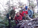
MechE ADK

1 November 2015
Halloween 2015
1 September 2015
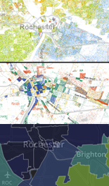
Race, jobs, and income: Three maps tell the story

20 August 2015
Anniversary flash flood
5 August 2015
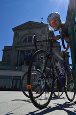
Montreal

7 May 2015
Bike to School Day

11 January 2015
Christmas 2014
6 January 2015
An Unrepeatable Process • 2014

25 October 2014
Halloween 2014

12 October 2014
Martha's 7th
1 October 2014
A grand vision: Rochester Bicycle Boulevards Plan

28 September 2014
People's Climate March

16 August 2014
Frankfurt

16 August 2014
Trieste

15 August 2014
Paris 4

12 August 2014
Paris 3
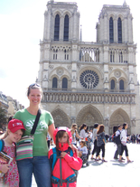
12 August 2014
Paris 2

11 August 2014
Paris 1

2 August 2014
Montagne des Sanges and Natzweiler
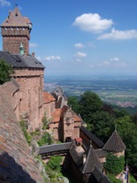
2 August 2014
Haut Koenigsbourg and La Volerie des Aigles

13 July 2014
Middle Settlement
9 July 2014
Best Transportation (We like bikes.)
4 July 2014
DBT in ROC
28 June 2014
Annual Performance Review
- To stay sane, exercise.
- Life is short, and time accelerates.
- Boys and girls are different.
- Know where your limits are: how very much is possible, and how very much is not.
- We can't make everybody happy all the time, and by trying, we fail at not just that goal but many others as well.
- Growing older, we naturally become more knowledgeable, and hope to become wiser, but don't become smarter. Never be afraid to live up to your potential now.
- Nobody can stomach a cocky jerk, but nobody's interested in a wet blanket.
- “Waste not, want not” goes a lot further than most people realize.

21 June 2014
Corbett's Glen

13 May 2014
Cobb's Hike
23 March 2014
Icy Niagara Falls

8 March 2014
Livermore
1 February 2014
Oberwolfach
6 January 2014
Know your town, and its data
1 January 2014
Security update: a password for the gallery

1 January 2014
Christmas 2013

23 December 2013
The Sound of What Happens • 2013
2 September 2013
Hats off to Mothers Out Front
29 August 2013
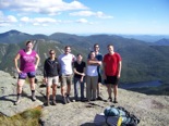
Algonquin

16 August 2013
Letchworth State Park
8 August 2013
Climate change in the news
8 June 2013
NSA's PRISM: Your data, mined without warrants

2 June 2013
Mt. Major

17 February 2013
Jessie = 7

9 February 2013
Possibly Historic

5 January 2013
Thanksgiving 2012
5 January 2013
Citizen surveillance in America
25 December 2012
Investing Time • 2012
15 December 2012
Mourning for Newtown
11 November 2012
Sustainability in the second term

31 October 2012
Halloween 2012
24 October 2012
A novel idea: National Popular Vote

30 September 2012
Camping at Bear Brook

2 September 2012
Doing the tourism thing

26 August 2012
Welcome to Boston, have a lobstah.
26 August 2012
We moved!
29 July 2012
Farewell New Haven!
20 July 2012
Global warming: Where we stand

20 July 2012
More from Hartwell

15 July 2012
Road Trip 2012
27 June 2012
Arts & Ideas 2012
16 June 2012
Updates, rehash, activity.

16 June 2012
BKLYN Memorial Day
28 August 2011
Moving Connecticut

21 August 2011
Park City Triathlon

7 August 2011
Martha Rides

24 July 2011
Norwalk Aquarium

10 June 2011
Munchkin Spring
18 May 2011
Cycling for sustainability

26 February 2011
Jessie's 5th
26 February 2011
Common ground with No Labels

26 February 2011
Winter of Eleven
13 February 2011
Bravo Egypt!
I am ready to die. I have a lot to lose in this life. I work in the best company to work for in the world, I have the best wife and I love my kids, but I'm willing to lose all of that for my dream to happen and no one is going to go against our desire—no one—and I'm telling this to Omar Sulieman, he is going to watch this: You are not going to stop us. Kidnap me, kidnap all my colleagues, put us in jail, kill us, do whatever you want to do. We are getting back our country. You guys have been ruining this country for 30 years. Enough. Enough. Enough!Somewhere Thomas Jefferson is smiling.
16 January 2011
Christmas 2010
30 December 2010
2010 B-sides

21 December 2010
To the Rising • 2010
9 December 2010
Autumn walks
2 November 2010
Haves and have-nots in America

1 November 2010
Halloween 2010
31 October 2010
Invaluable journalism from PolitiFact and ProPublica

24 October 2010
Martha's 3rd

19 August 2010
Cycling Jessie
8 August 2010
Northern Presidentials

18 July 2010
Callaway Gardens
16 July 2010
Litchfield 2010
4 July 2010
Going too far: the Protecting Cyberspace Act

1 July 2010
Maeve's 3rd
1 July 2010
Art & Ideas Festival

5 June 2010
Presidentials

1 June 2010
Garden 2010
5 April 2010
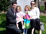
Easter 2010

5 April 2010
West Rock Nature Center

5 April 2010
Portland Rambling

5 April 2010
MD/VA Visit

17 January 2010
09 Hodgepodge
17 January 2010
Spotlight on transparency

9 January 2010
Christmas 2009
20 December 2009
Time Being Precious • 2009

1 November 2009
Halloween 2009

12 October 2009
Laura & Imtiaz / New Orleans
12 October 2009
Grand challenge: Finding sustainability

5 October 2009
Martha's 2nd

5 August 2009
Great Circle

26 July 2009
Toddler Summer

1 July 2009
Visiting Us

20 June 2009
Graduation Trip

16 May 2009
East Rock bits
21 April 2009
Shout out to the CREW
7 April 2009
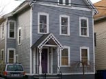
CT hello

4 April 2009
MD farewell

20 February 2009
Snip, chop, buzz
8 February 2009
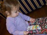
Christmas 2008

21 December 2008
Insight 2008

6 November 2008
Halloween 2008

3 November 2008
Naylor's Beach

3 November 2008
Zoo Crew

3 November 2008
Toddler Time
3 August 2008
Required reading: the U.S. Constitution

19 June 2008
Progress
19 June 2008
Tax Policy Center on candidates' plans

19 June 2008
Litchfield 2008

19 June 2008
Austin

19 June 2008
Shenandoah

19 June 2008
B & ML Easter
9 March 2008
Making poverty history: the One Campaign

1 March 2008
Out & About

1 March 2008
Home Base
24 February 2008
Jessie's 2nd
9 February 2008
Science/politics, politics/science
9 February 2008
Iraq War in retrospect
1 February 2008
Climate change consensus from the IPCC
12 January 2008
Straightening out candidates' facts: FactCheck.org
12 January 2008
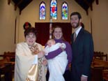
Martha's Baptism
12 January 2008
Straight facts on candidates: VoteSmart.org

6 January 2008
Christmas 2007

30 December 2007
Conversation • 2007
23 November 2007
Family Time

14 October 2007
Baltimore Marathon

6 October 2007
Martha's First Days

6 October 2007
Ella!
15 September 2007
Charm City & Cuties
19 August 2007
Planpraz

12 August 2007
La Jonction
19 August 2007
Around Les Houches

5 August 2007
Les Rognes and Le Prarion
14 July 2007
Warren, NH

29 June 2007
Litchfield Beach

28 May 2007
Cutie no. 1


